If the three most important rules of real estate are “Location, location, location,” then the rules of billboard advertising (and most advertising for that matter) are “Creative, creative, creative.” You can pick the biggest billboards at the busiest corners, or place ads in the glossiest magazines, but if your creative copy fails to hit your target audience with a compelling, interesting, fun message, then your advertising dollars will not generate a return.
Within our Chicago billboard company, one of our favorite books distills this message into its purest (if most blunt) form in the aptly titled Nobody Wants to Read Your Sh*t by Steven Pressfield. Mr. Pressfield, the author of the The Legend of Bagger Vance and many other novels, began his career as a Madison Avenue copywriter.
"It isn’t that people are mean or cruel. They’re just busy. Nobody wants to read your shit.”
In the book, Mr. Pressfield makes the point, “Nobody wants to read anything. Let me repeat that. Nobody – not even your dog or your mother – has the slightest interest in your commercial for Rice Krispies or Delco Batteries or Preparation H. Nor does anybody care about your one act play, your Facebook page or your new sesame chicken joint at Canal and Tchoupitoulas. It isn’t that people are mean or cruel. They’re just busy. Nobody wants to read your shit.”
We don’t claim to be the original Mad Men, but we do consider ourselves experts in outdoor advertising in Chicago. Whether we are working with a realtor in Lincoln Park, a dentist with four offices across Chicago, or a large area hospital, we start from the assumption that people are too busy for your message.
It starts with understanding how viewers view and understand visual media. People often understand billboard ads and other visual media through emotional, rational, and cultural lenses. The order isn’t always the same, though we often react emotionally through instinct, so all of these are important to consider when designing billboard creative.
One of the first reactions toward visual media is the emotional reaction. This reaction is instinctual—the viewer cannot control the first emotion the ad brings out in them. Humor is crucial here. If you create an ad that is genuinely funny or quirky, it can be a great avenue toward the person’s heart. Humor can also be good for ad recall, since the “joke” can live on in your audience’s mind for even a few days.
Viewers also have a rational reaction, where they understand the message. Here, interpretation is key, making sure the text makes sense, making sure it connects with the imagery. Finally, there’s also a cultural reaction, where the viewer makes a decision about the ad and whether or not it’s relevant to them personally. It’s a cultural moment because the product might not be part of their “culture,” so to speak. If a teenager sees an ad about diapers is probably not part of their life, so the ad would be irrelevant.
On the other hand, if the ad is about a new smartphone, or about a pair of shoes, well now they will consider it relevant, even if they decide not to make a purchase in that moment. The fact that the ad is relevant to them is a great step toward making an audience member a new customer.
Once the viewer has read through the message and connected the imagery with the text (or sometimes the images alone can tell a story), they can begin to think about a purchasing decision logically. Do I need this product? If so, this might be a good option. Customers like it when companies make their lives easier, so if you make an offer through your creative that simplifies their lives for a reasonable price, you won’t have trouble securing new customers and re-engaging older ones. And this can all be boosted through engaging creative.
With creative, the goal is not just to make your audience read your message, but rather to have them find your product and brand relevant to their lives.
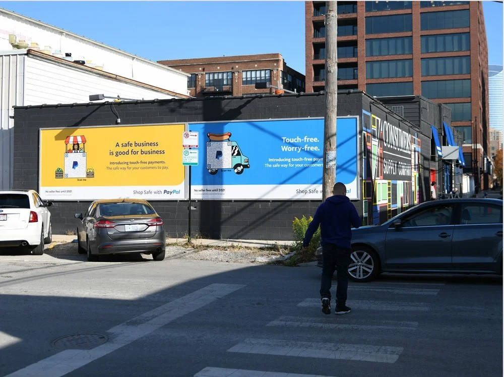
We work with advertisers to design creative copy that will grab the attention of their audience and promote engagement. One of the main strategies we use to decide on good creative is the three B’s of billboard design: brevity, branding, and borders.
Brevity is key in most advertising. As mentioned above, no one wants to read your message. If you make it short, your audience will be done reading it before they realize they’ve read it, and you’ll already be present in their mind. The best way to be succinct is to rely on a core idea. What’s the main point you’re trying to get across to your audience, whether it’s about your product or about your brand? Your messaging should clearly express this sentiment.
Also, your message is competing with other brands. Branding is key because it’s one of the main ways your brand stands out from competitors. These other brands are spending time crafting sleek slogans and unforgettable creative, so that means your company has to step it up if you want to stand out. Including your logo on your creative (usually toward the bottom right in horizontal units and the top half in vertical units) is necessary. You can even use your brand colors throughout the ad to produce a subtle reminder of your company. In essence, you want everyone who sees your creative to know exactly what company it belongs to without having to do any research.
Finally, consider borders when designing creative for your next campaign. While outdoor advertising panels are mostly rectangular shapes, the borders can be played with in creative ways to make your ad stand out. Changing the shape of the creative can provide a greater impact because viewers will notice it’s out of the ordinary, and people tend to like when companies go out of their way to do something fun. Another way to break out of the border is to use more than one panel for the campaign. Panels that work together often tell a more profound story, and they engage the viewer more as well.
Furthermore, think about borders in a figurative way, too. How can your billboard campaign break out of its own medium and into social media, online ads, TV commercials, and more? Integrating your billboard campaign (and your creative) with other advertising media can make your imagery more ubiquitous and more impactful.
Here’s how good creative can help you improve your marketing campaigns.
Memorable Messages
When you make good creative, you are creating the billboard equivalent of an earworm. In music, earworms are songs that people keep hearing after the song is over. Often, the song plays over and over in people’s minds, and in many cases the song is engineered to do just that. With billboards, you can create a message or image that can stay with the viewer
Constant Reminder of Your Brand
Billboards are up all day and night, which means that you’re reaching audience members all the time. It’s not like a television ad, where it is only shown a few times a day. Furthermore, billboards can’t be ignored like other ads can. They can’t be switched off or switched over. If your billboard has compelling creative, you can take advantage of its presence.
Use New Technology
Creative is just as important as the implementation of the ad copy. Using the same imagery throughout various media (or even using digital OOH) can bring your creative to another level, especially through animation and text effects. Ideally, you’re preparing your audience so that every time they see or encounter your brand, they remember your creative, and they can have a positive emotional and rational reaction that helps them make a purchasing decision.
Good advertising copy placed on targeted neighborhood billboard locations is a combination that drives results for our customers. If you believe your business and brand are compelling enough that your target audience really should know about you, then we can help you design ad copy that conveys your message in a clear, fun, impactful way.









With sales during the holiday season surging over $1 trillion, businesses can’t afford to ignore this ideal time for advertising. OOH is strongly poised to help you take advantage of the higher spending that occurs during the holidays. Read more for tips on winter advertising and marketing campaign ideas that you could pair with outdoor advertising.