Real estate agents and property owners rely on out of home advertising—especially in Chicago—to increase visibility and brand awareness. From chicago billboard placements to bus stop ads and wild postings, creative campaigns can make a big impact.
Real estate billboards don’t have to be boring—they can set your brand apart from your competition and help you sell an experience. Check out these thirteen real estate billboards and tell us which one is your favorite!
Whether you're looking for real estate billboard ideas or want to stand out with a unique advertisement billboard for a restaurant, these examples show how effective hyper local advertising can be.
1. More Than Just Homes
This billboard by KlopasStratton makes a bold impression. The imagery of happy children in a pillow fight is eye-catching, and helps paint a picture of what they want their audience to remember: Living in luxury apartments can make families happier, especially children who want to pillow-fight. And the falling feathers from the pillows echo the falling snow during that winter. All-around, a great image to make their point: you would be happier in Bucktown.
2. More Than a Home Pt. 2
Baird & Warner’s creative is sleek and eye-catching. The young man seems to rest his head against the building, and a cute dog lays on him. There’s a satisfaction in his demeanor, and it’s because he teamed up with Baird & Warner to help him find the perfect place to live. Images can do an amazing job of making people feel nostalgic for a yard, for instance. A yard where your new dog can run around.
3. Live Your Best Life
Barbara Sapstein can easily gain more confidence with this billboard. People will internalize her name and her face, and when thinking of buying or selling in River North, it’s hard not to remember the lady who told you to “live your best life”—a positive message can go a long way. When you’re ready to buy or sell in River North, Barbara will be there to help.
4. Local Market Expert
Eddie Garcia knows that real estate isn’t about being flashy; it’s about being yourself. He’s smart to put his face on this billboard because now he can be a recognizable face and name in this community. The short message, the simple imagery—it works to showcase who he is, someone who will get to the point and really help you.
5. We Can Help
Aimed at the younger generation, this billboard seeks to provide comfort. The search for an apartment or a place to live can be challenging, especially if you’re not from Chicago. Many students, for example, find themselves moving here to attend a college or university. This could be the perfect audience to help with their real estate needs. The professional imagery can instill confidence in their brand and help increase their reliability.
This kind of campaign could also double as a billboard targeting college students, especially those near DePaul or UIC—perfect for anyone researching the best way to advertise to students about off campus housing.
6. Second Easiest Choice
Dan Fowler also opted for the cute image to catch his audience’s attention. The stylish boy makes you look, and then part of how billboards work is they make you ask yourself a question: what is this ad about? We’re naturally curious, so people will often read the ad to understand how the imagery and the messaging correlate. By that point, Dan Fowler has succeed in spreading brand awareness.
7. My Focus
What a simple take, but it works so well! It’s an honest representation of what he promises to his clients. It is heavy on the text, but it came at a time when human connection was important. This heartfelt message would have been very welcome at the start of the pandemic.
8. Triangle Square Chicago
Super simple message and simple creative as well. The bold primary colors do an amazing job to catch your attention. Then, the message is quick: here are the prices for new condos. In this case, Belgravia also used the same branding and look on their website, making it much easier for their audience to associate this billboard to their online presence.
9. Smile!
This Hotspot works on a few levels. As we’ve discussed earlier, the smiling mother and child tells us exactly who the audience for this ad is, and it also catches our attention. The billboard then quickly tells the audience the price for a new home, but it also does something better—it gives them something to do if they’re interested. Make a left on Belmont, and you’ll get to Lexington Village and you can see the homes for yourself. That will definitely be much more powerful than just seeing a billboard.
10. Boutique and Luxury
It’s hard to ignore the image of the rooftop pool—it looks so appealing. The rest is easy to digest quickly, which is the point of most billboards. The name pops out, and so does the description and the website. For those interested in luxury residences, this will definitely make an impression. A quick visit to their website is already a success, especially if you can have them sign up for your newsletter or email list.
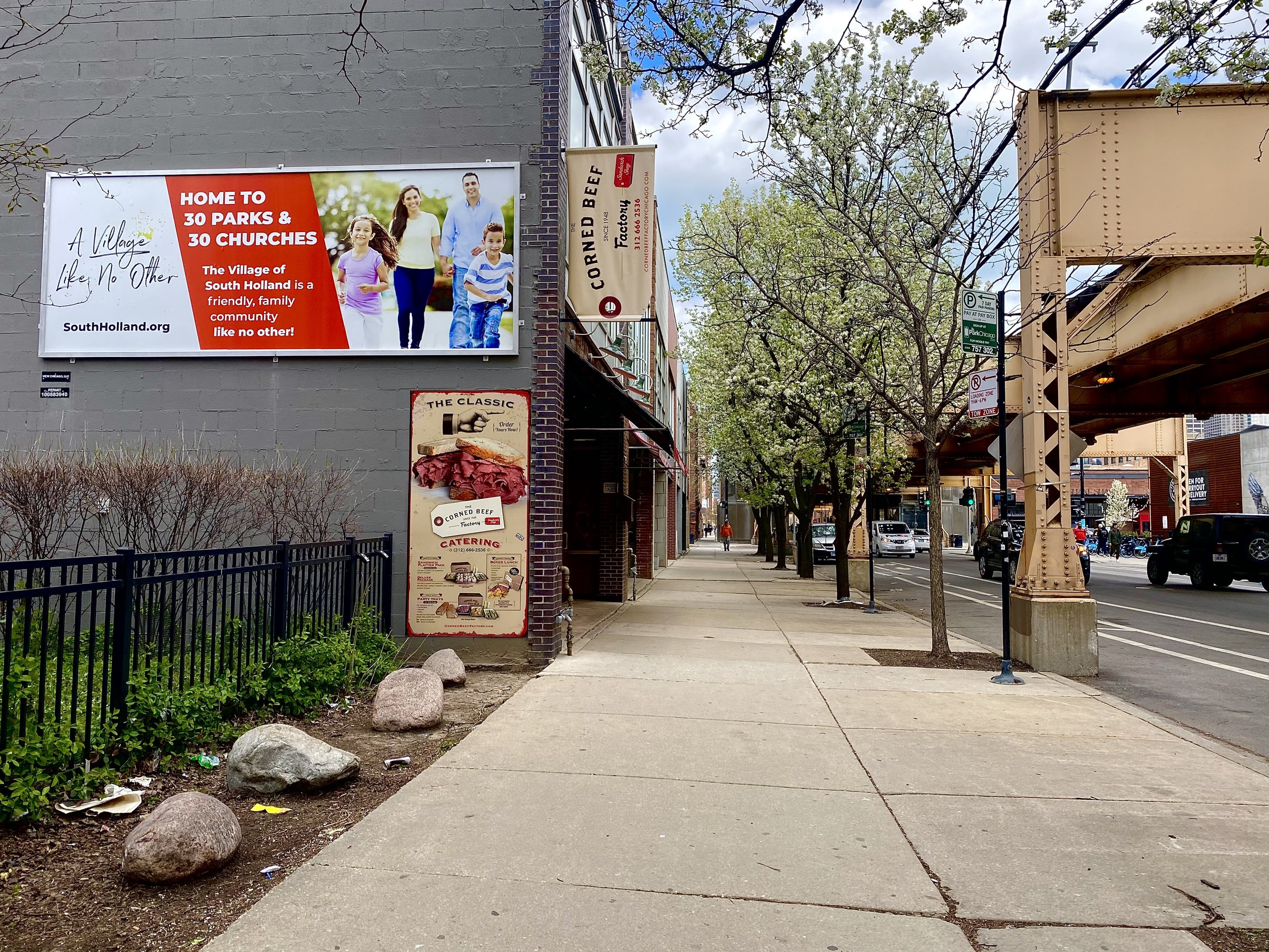
11. 30 Parks & 30 Churches
Knowing your audience is half the battle. This is why this ad works—when you advertise more specifically, you get more results. By specifically mentioning parks and churches, they are linking their brand with a family atmosphere. Telling your Christian audience that you have a lot of churches can be a great selling point.
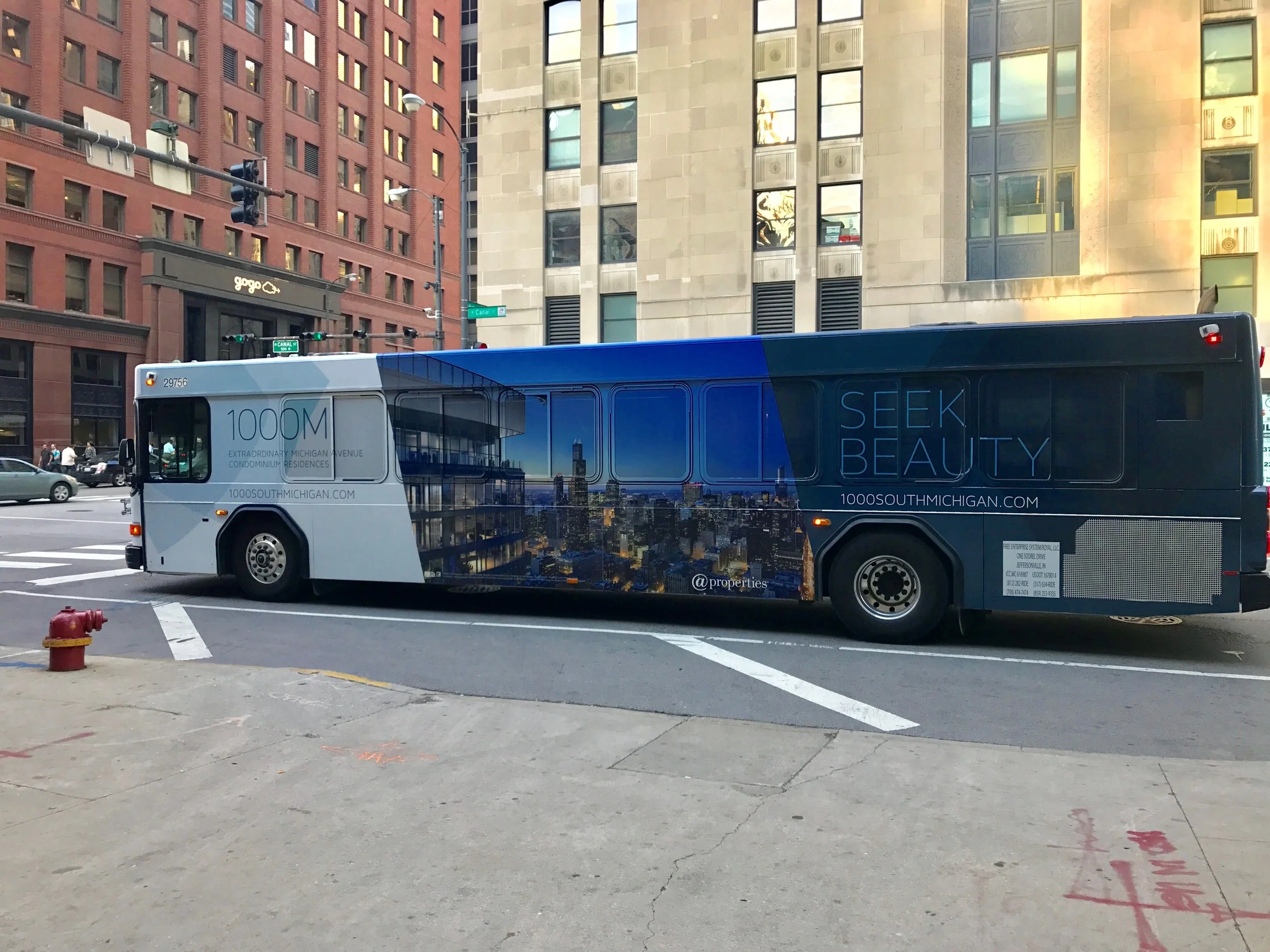
12. Seek Beauty
Bus Wraps speak for themselves. They’re moving billboards and make a great first impression. People often follow the bus with their eyes to read the full message—in a few moments, it will be gone. In this case, the Bus Wrap makes the largest words clear: “seek beauty.” They are selling a top-of-the-line experience, not just apartments. It’s beauty, not just a place to live.
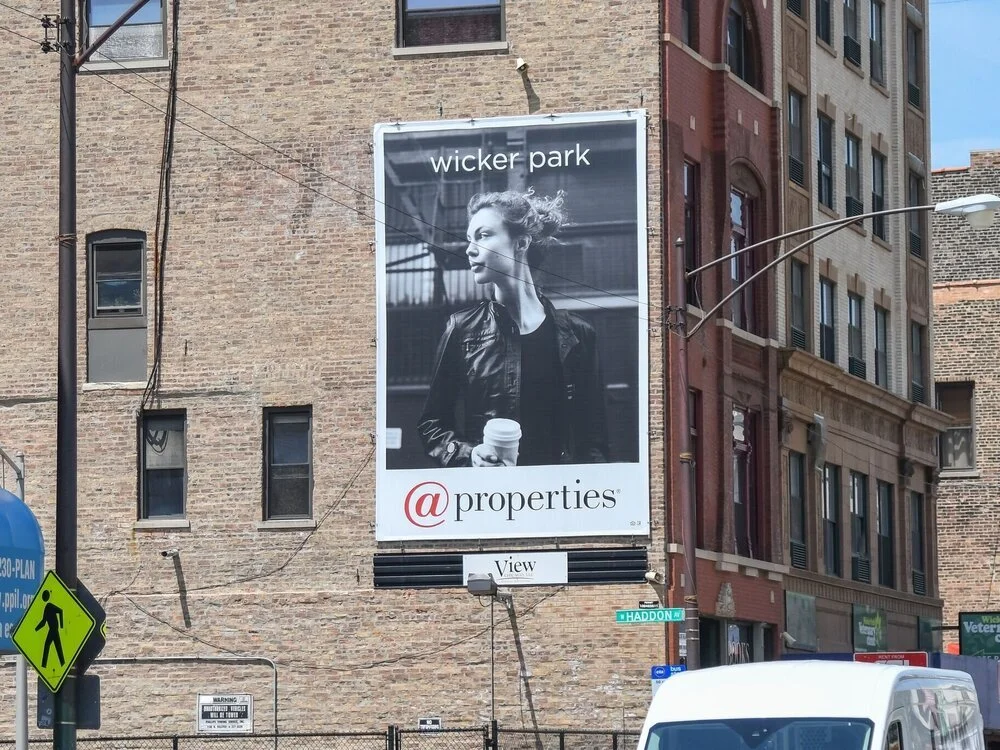
13. Wicker Park
Last but not least—this is one of our favorite outdoor ads. There’s no need for any more text than “Wicker Park.” @properties is targeting a lifestyle. Those that connect with this image are much more likely to pick @properties when trying to buy or sell in Wicker Park. It’s a powerful image that captures your attention, and then making the audience read between the lines makes the billboard an impactful experience.
